Website design
Ready for all devices
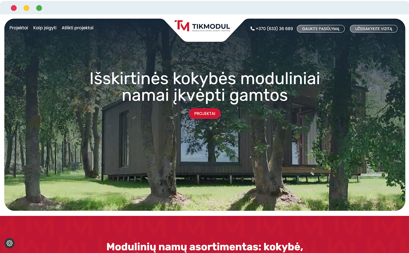
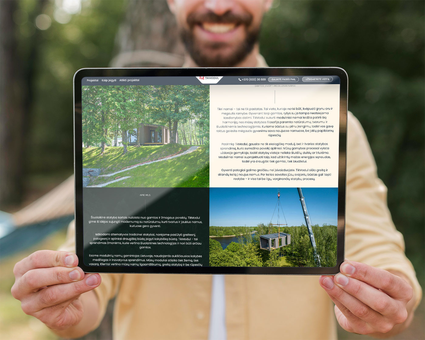
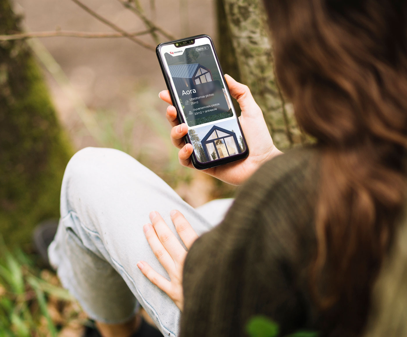
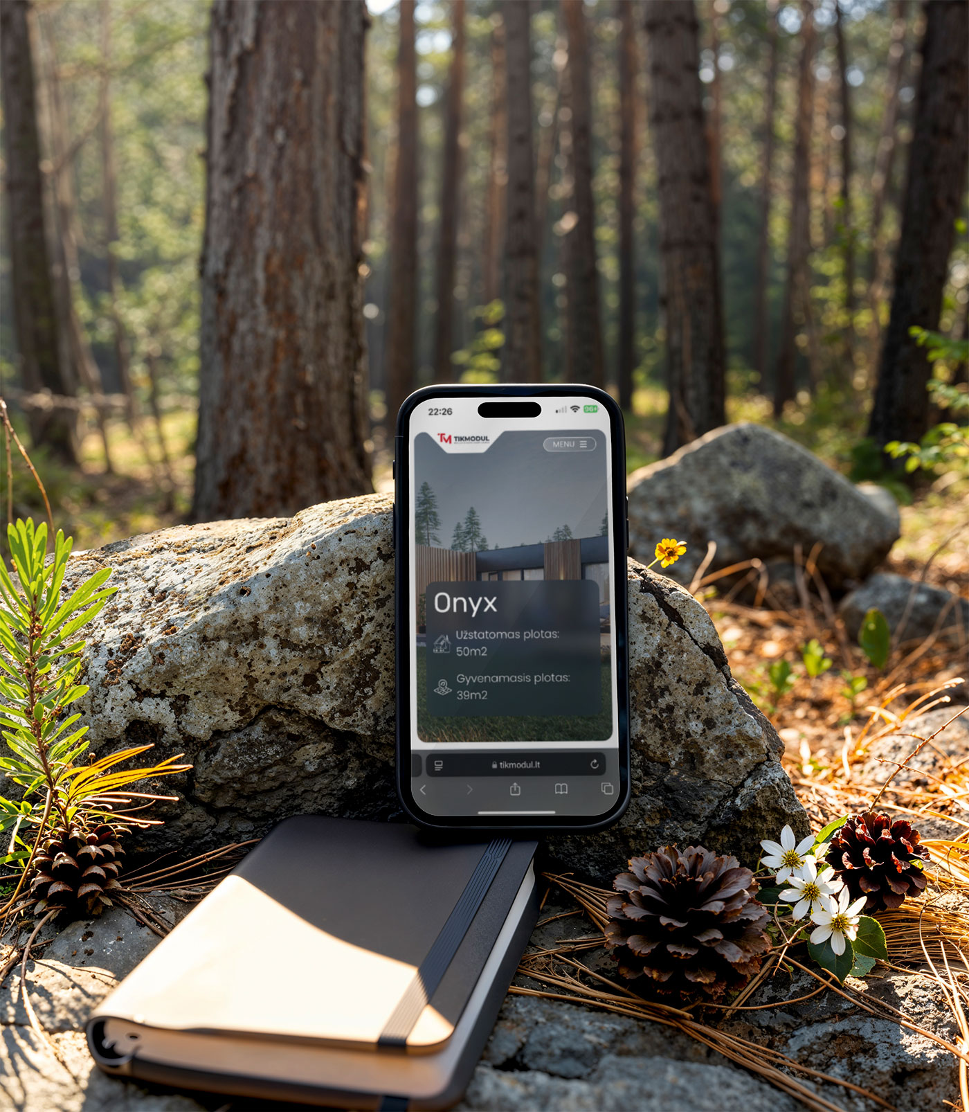
The website design was carefully designed with a mobile-first approach, ensuring users get the best possible experience no matter where or how they’re browsing. With more and more visitors exploring online content from their phones, it was essential to create a site that loads quickly, feels natural to use, and looks just as impressive on smaller screens as it does on desktop. From the initial wireframes to final touches, mobile usability was at the heart of every design choice we made. This makes it easy for users to scroll, tap and navigate without friction. Making sure that customers can access the website on a quick lunch break, commuting, or relaxing at home, visitors can easily discover TikModul’s modular homes, view projects, and connect with the brand everywhre and always.
Fast Load Times – Optimised website code and images mean pages load quickly, even on slower connections
Responsive Layouts – The website adapts beautifully to all screen sizes like phones, tablets and smart fridges.
Compact Menu – A simplified mobile menu keeps navigation tidy and accessible with minimal effort.
Consistent Brand Feel – The bold visual identity and colour scheme carry through on mobile, reinforcing recognition.